JPTE Engenharia: Brazilian engineering firm with over two decades of proven expertise
Challenge
Following a recent acquisition, JPTE needed a compelling new brand identity reflecting its evolved structure, leadership, and innovative direction.
Solution
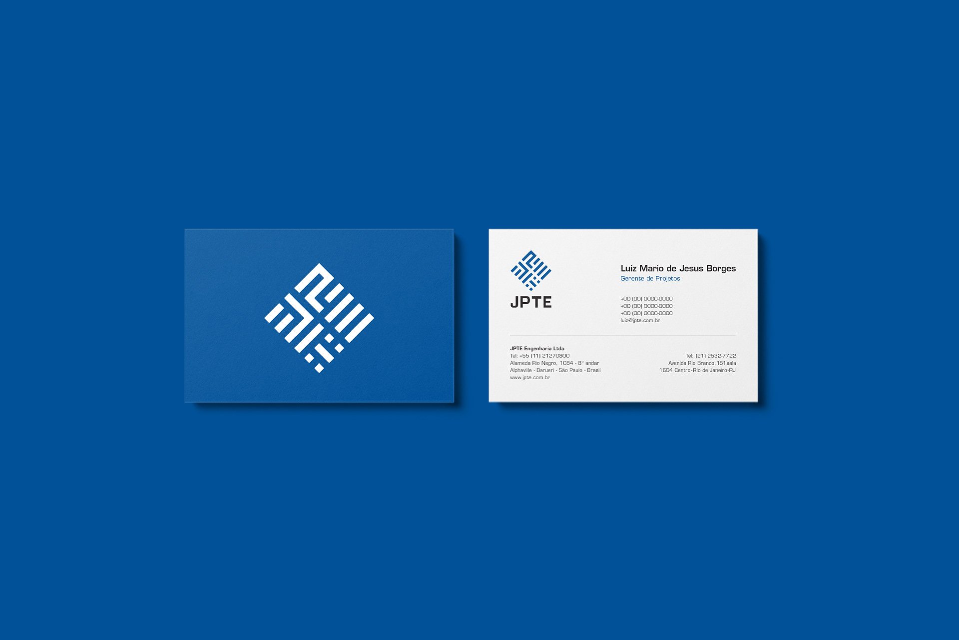
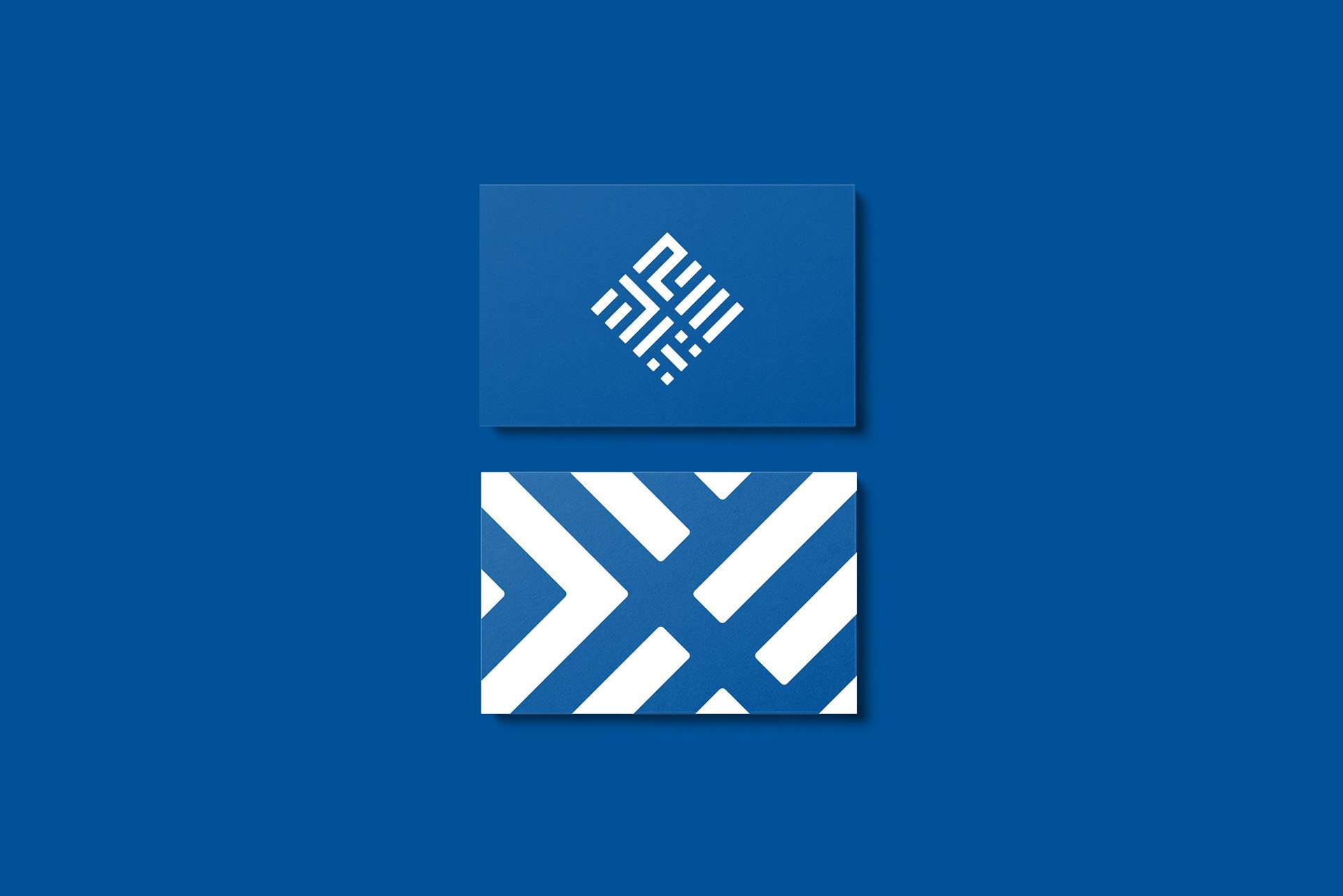
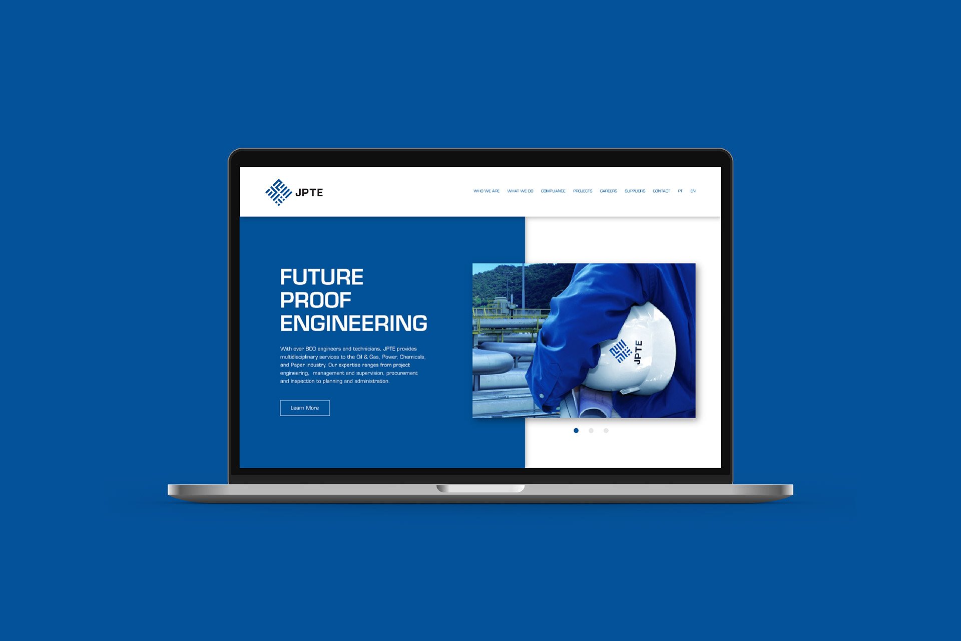
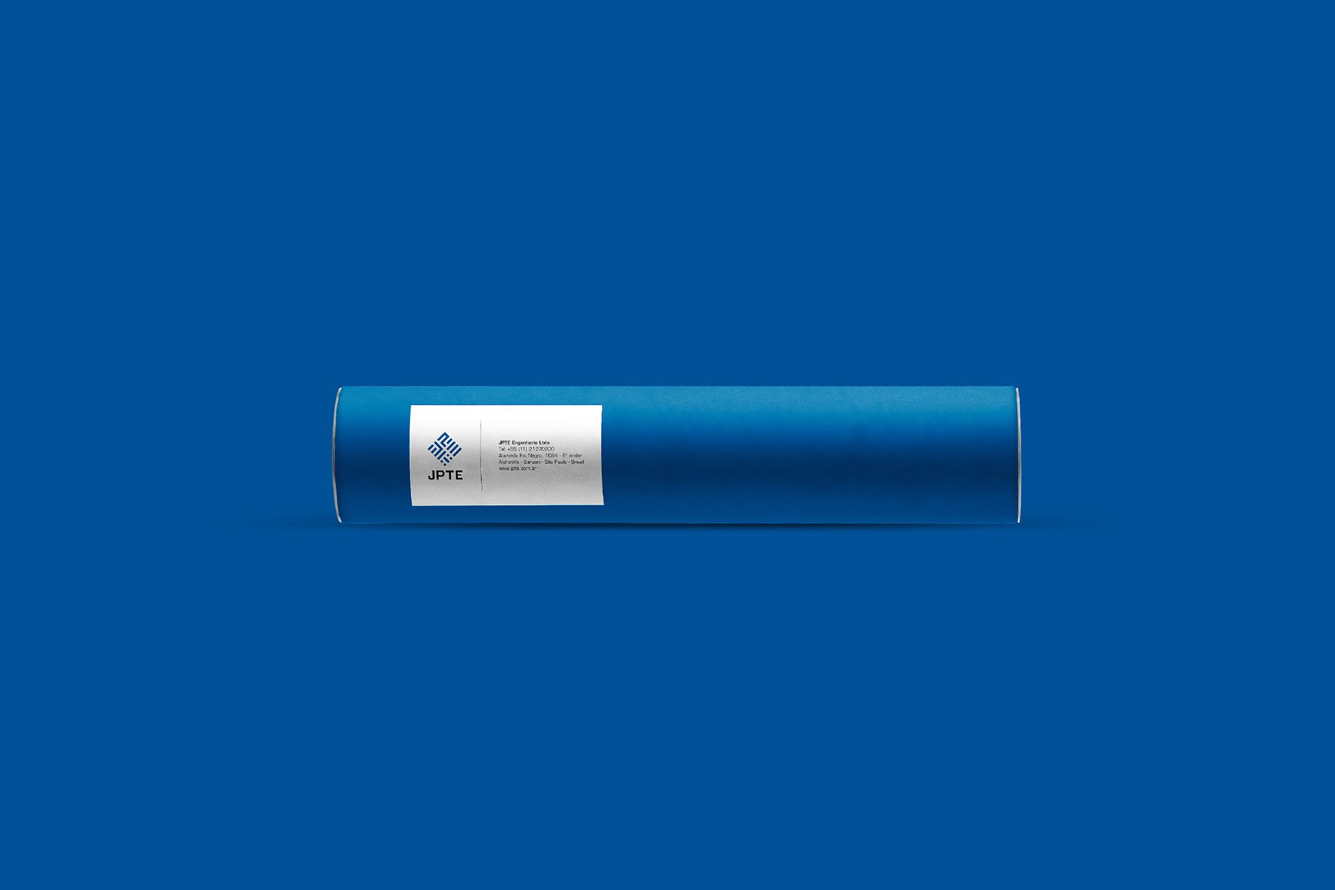
We crafted an impactful identity inspired by JPTE's foundational values and the Brazilian flag, using a distinctive diagonal square to symbolize stability and national pride. The color blue was strategically chosen to communicate safety, reliability, and the refreshment of new leadership.
Results
The rebrand successfully attracted new clients, improved market perception, and elevated JPTE’s status as an innovative, reliable partner within Brazil's competitive engineering sector.


